
Interactive storytelling
As a Design Editor at The Washington Post, I assigned digital projects to designers and developers; provided input and feedback throughout the process (from Figma iterations and UX/UI considerations of bespoke components to the final design and art direction of the page); worked in concert with editors and reporters to shape the storytelling; helped construct photo edits; ensured that the work met the highest standards of design; and developed retrospectives that used data analytics to inform future decisions.
🔎 Tap on each image to see full story
-
User name: faaawnt@gmail.com
Password: @01PostLinks
Investigations
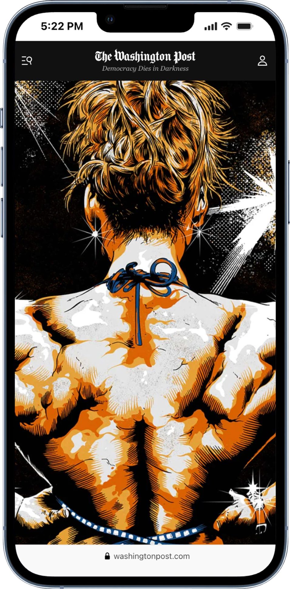
For this series, we wanted to have illustrations that were as foreboding as the stories. The illustrations, which fully reveal themselves on scroll, were intended to be minimalistic on first arrival to reduce sensationalizing what was a serious problem.
Designers: Jake Crump and Natalie Vineberg
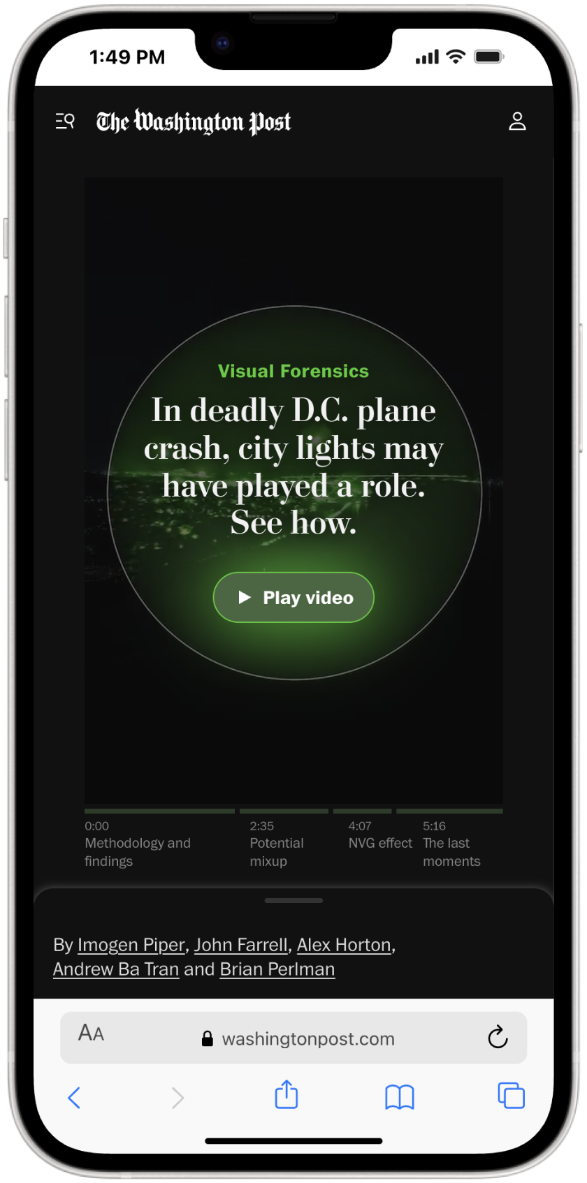
We leaned into focusing the page almost entirely on a full-length video that investigated the plane crash and gave readers an inside look at how the Visual Forensics team did the work. We placed the text of the story in a drawer on mobile, intentionally reducing its place in the visual hierarchy while keeping it accessible.
Designer: Tyler Remmel
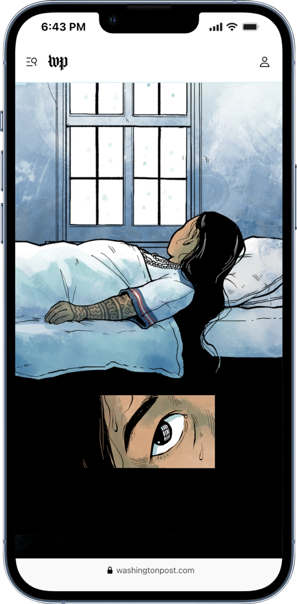
A Pulitzer Prize finalist for illustrated reporting, this heartbreaking story from the past made for a perfect presentation for the present. The page relied solely on illustrations and subtle hints of animation, staying laser focused on the mobile experience.
Designers: Tara McCarty, Audrey Valbuena and Hannah Good
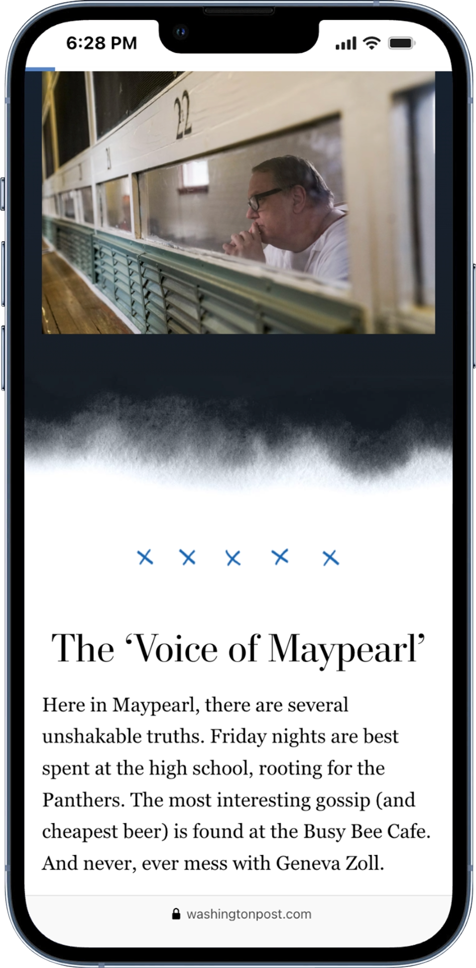
This page implemented a series of videos that were fundamental to understanding the text portions of the story. One could not live without the other. It was a challenge that required us to work hand-in-hand with the editors and reporters to stitch the experience together.
Designer: Tucker Harris
Health, wellness and science
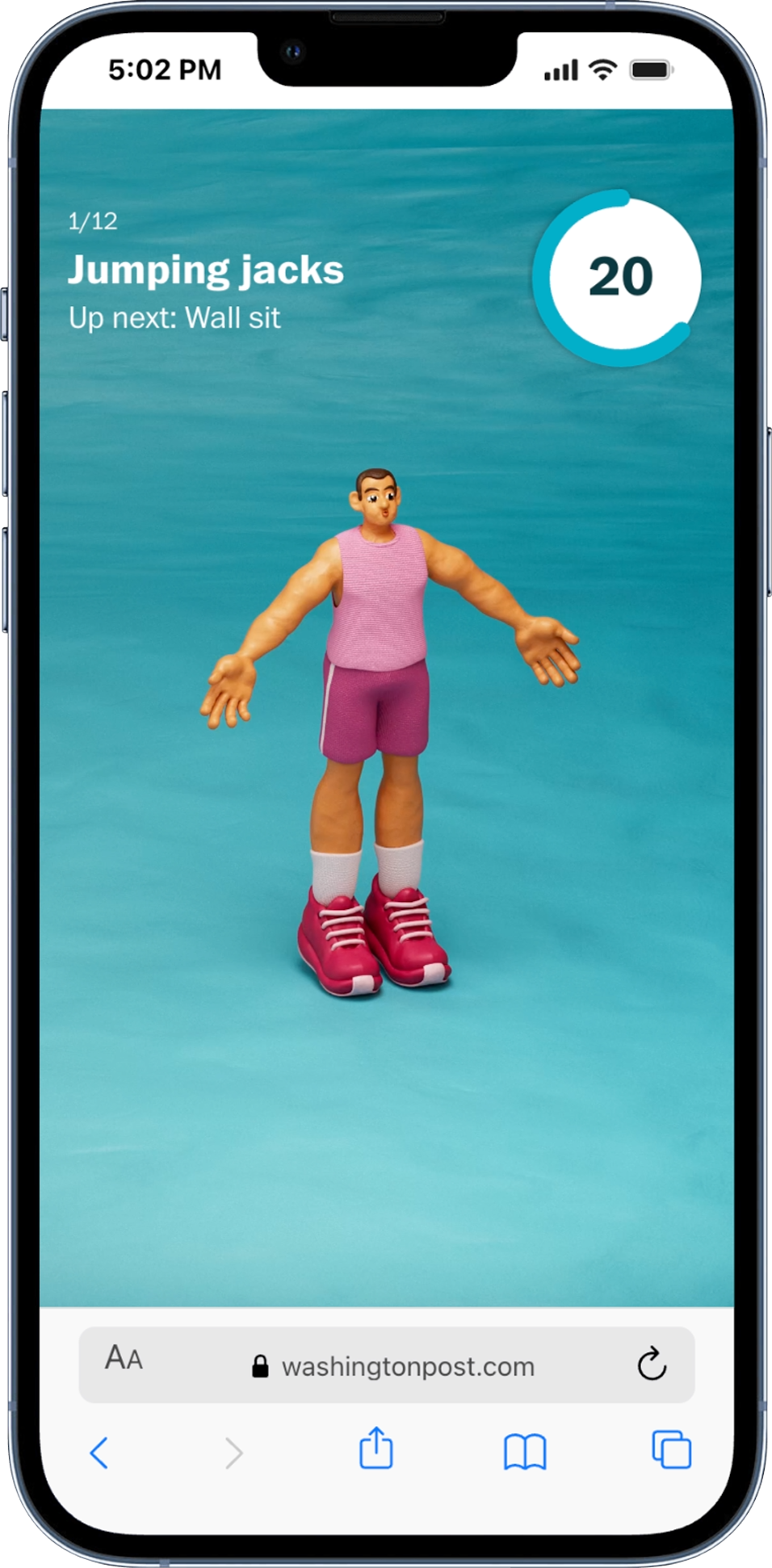
This was a four-part series featuring animated workout videos. We experimented with ways of increasing engagement on the videos while making it easy to do the workout on (or off) the Post site.
Designers: Chelsea Conrad and Carson TerBush
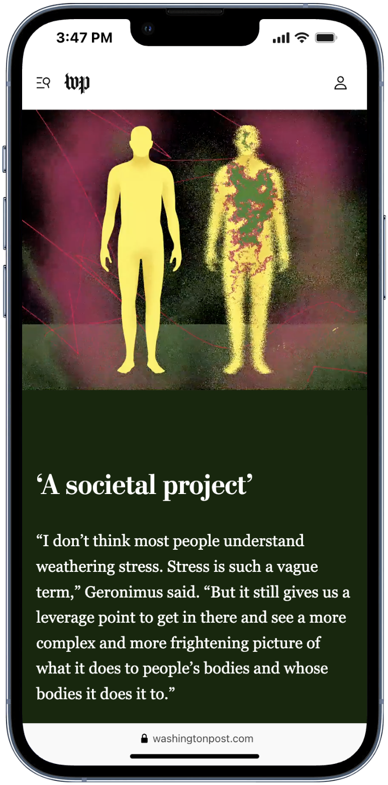
This page used a series of somewhat frenetic illustrations to show how stress affects the body while introducing a sense of unease. Stitching together the page was a challenge and each moment of illustration was based on the science.
Designers: Stephanie Hays, Agnes Lee and Carson TerBush
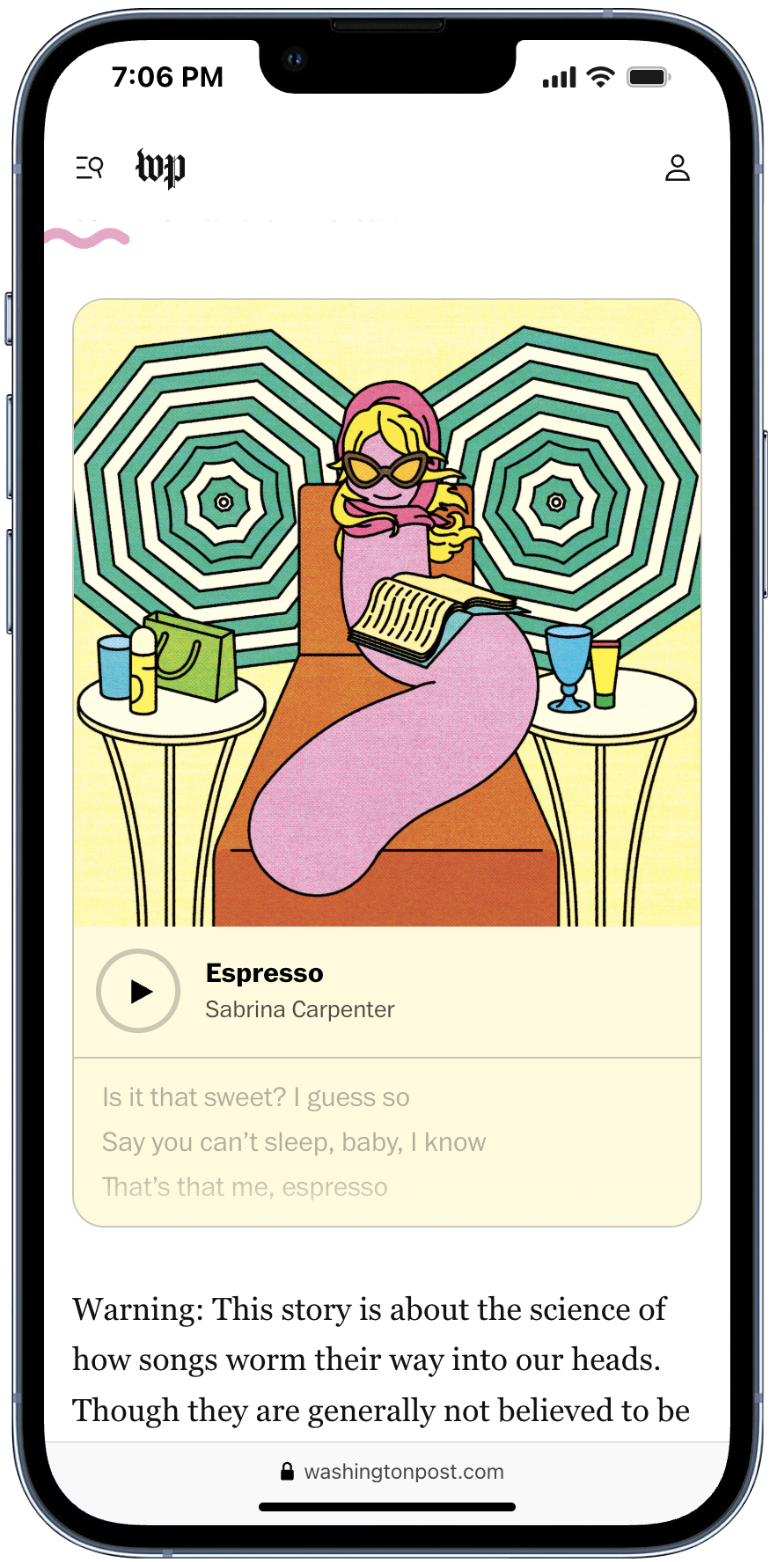
We had one goal on this page: Have fun (while leveraging science to help readers understand the phenomenon). We used audio and reader-response components to make the page as entertaining as possible.
Designers: Chelsea Conrad and Tucker Harris
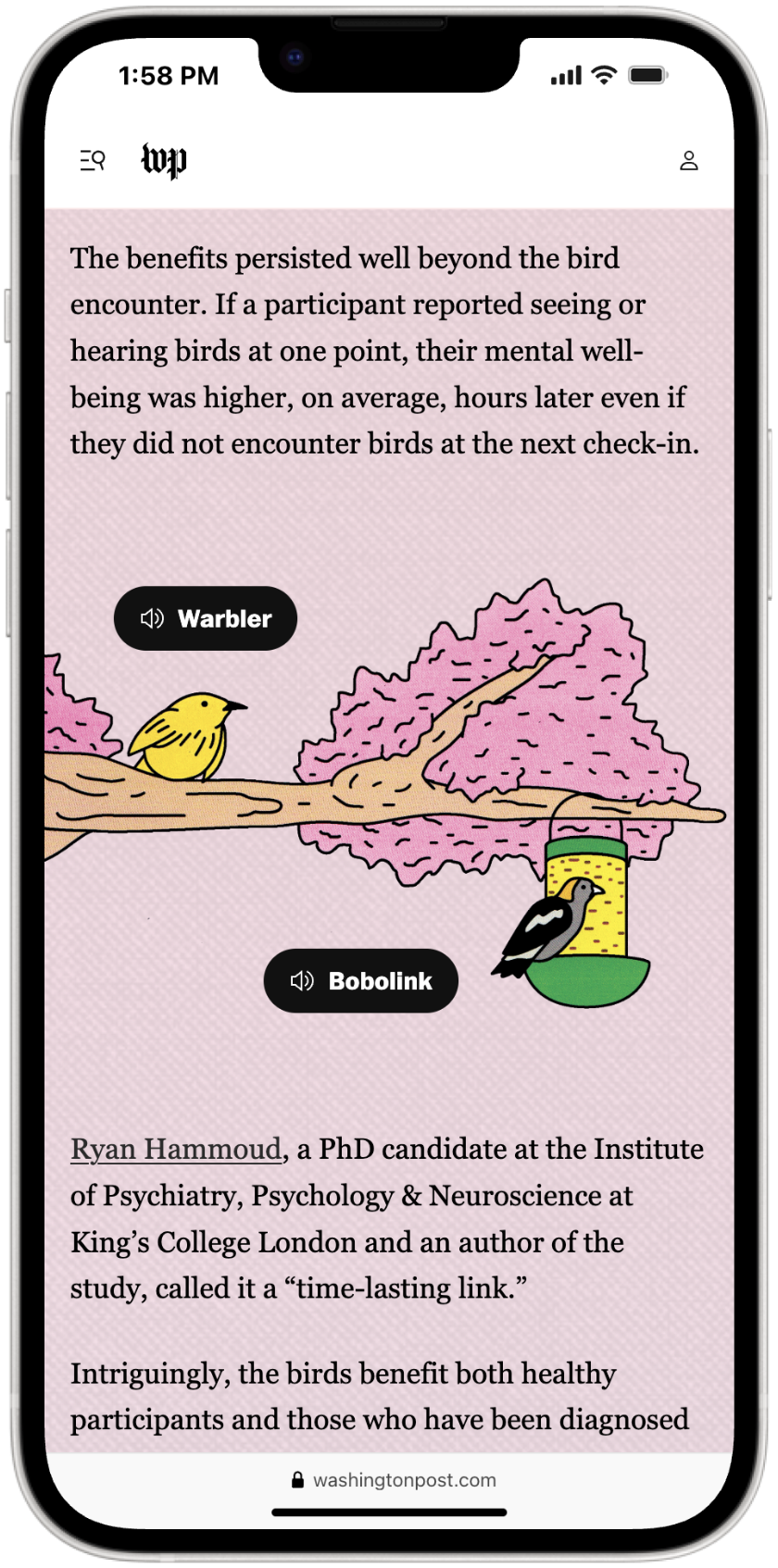
Getting readers to engage with audio on the Post site was difficult — even when the stories were about audio. In this case, the whimsical illustrations and easy-to-use audio components went a long way in keeping readers interested.
Designers: Chelsea Conrad and Garland Potts
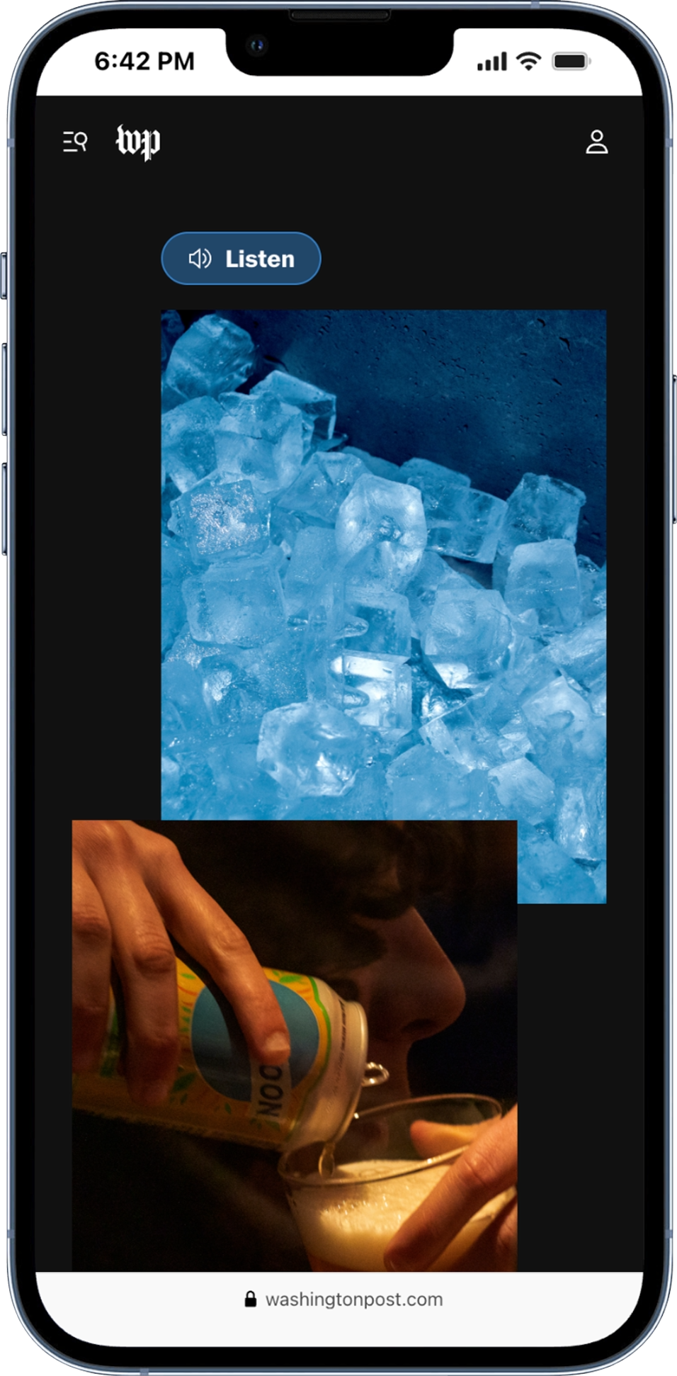
We wanted the reader to feel like they were in a noisy restaurant. The audio, data visuals and photography combine to create a rich yet somewhat uneasy experience.
Designers: Elizabeth von Oehsen and Carson TerBush
For this beautiful story about life and death, we mostly wanted to stay out of the way. We implemented a countdown to build anticipation in an effort to drive readers down the page.
Designers: Chelsea Conrad and Emily Wright
Local
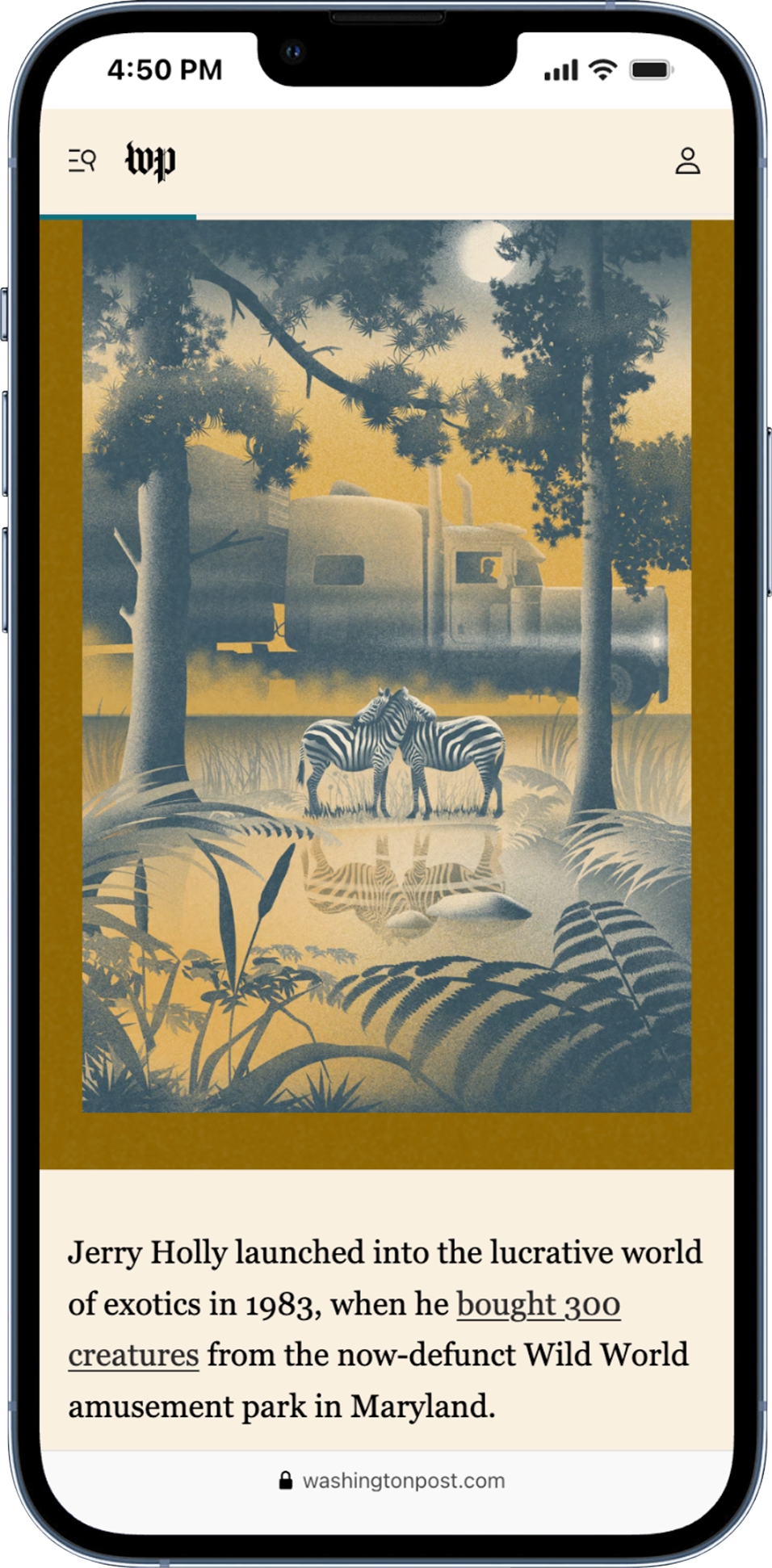
The challenge for this wild story about zebras was to create visuals for a story that didn’t have any. Enter: Illustrations based on facts (and some very liberal creative license). Working directly from the reporter’s findings, each scene is an approximate representation of what really happened but with a pinch of surrealism.
Designers: Laura Padilla Castellanos and Carson TerBush
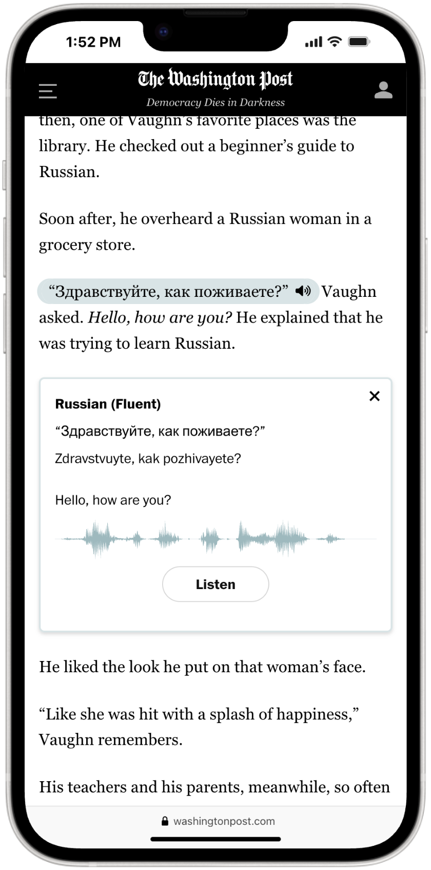
The audio examples sprinkled throughout the story enhanced the experience in three ways: (1) They made it entertaining; (2) They made the story easier to understand; and (3) they verified that the man does indeed speak 24 languages.
Designers: Emily Wright and Garland Potts
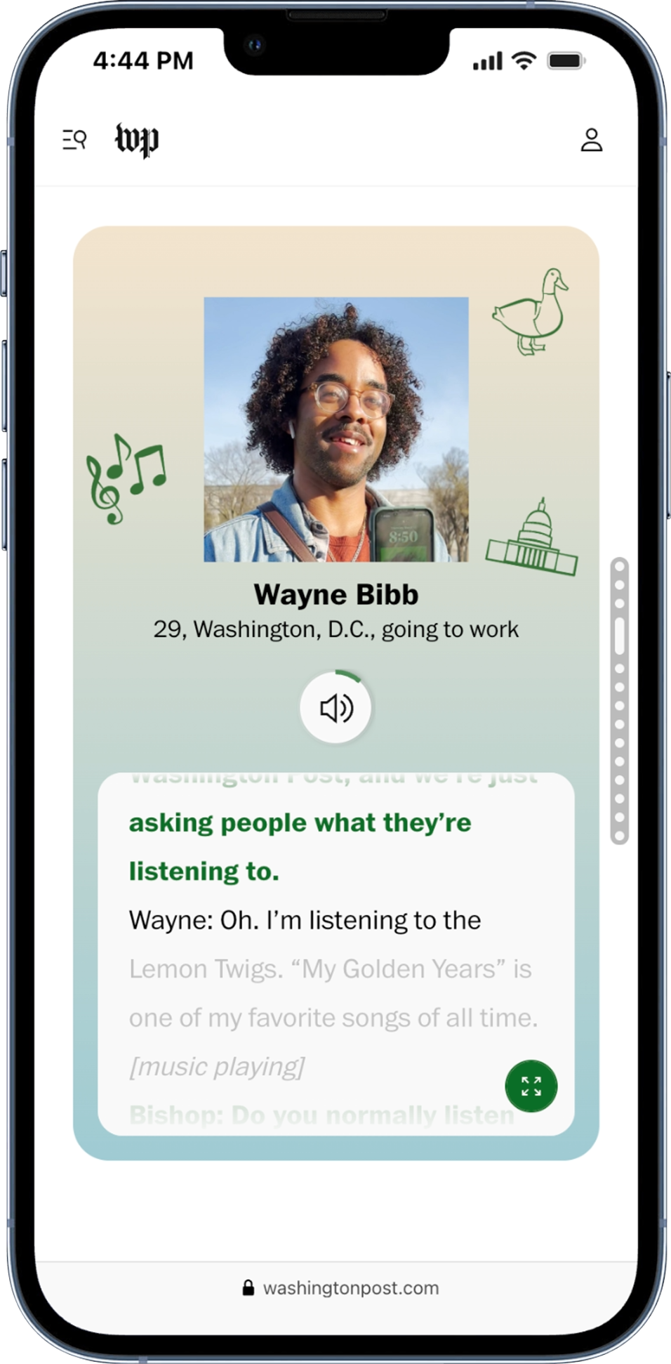
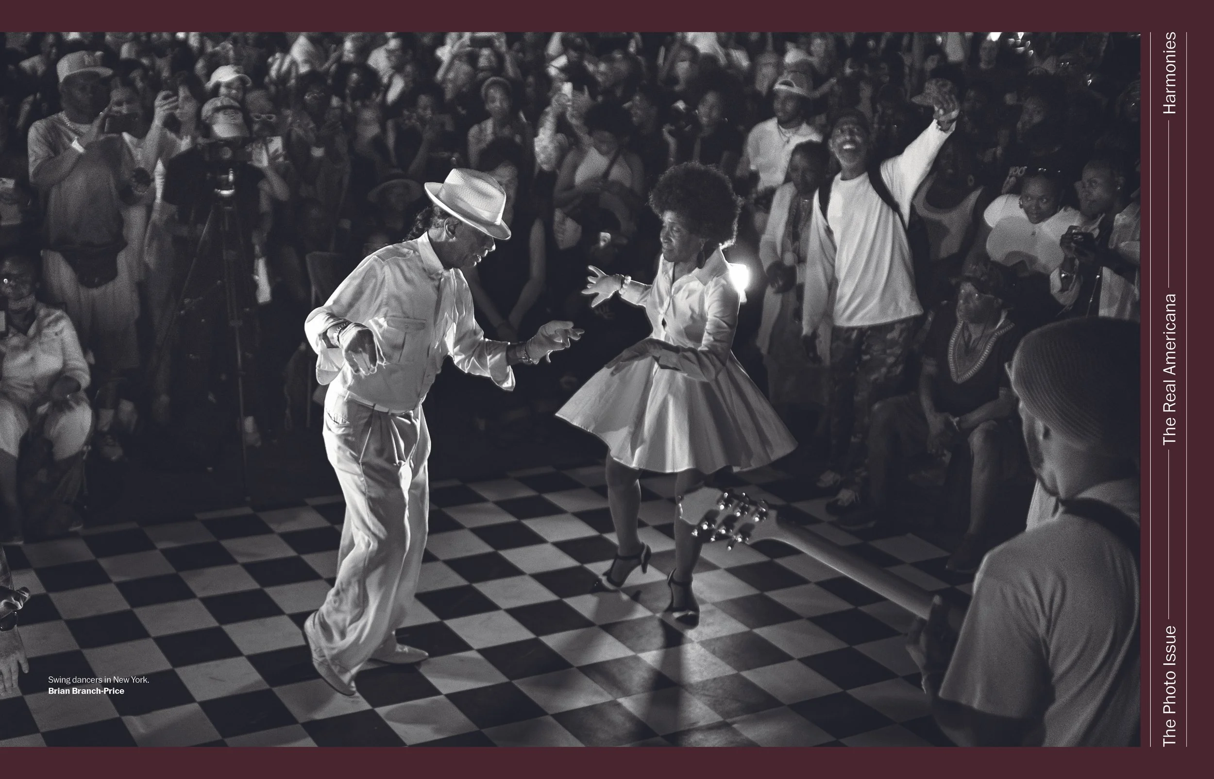
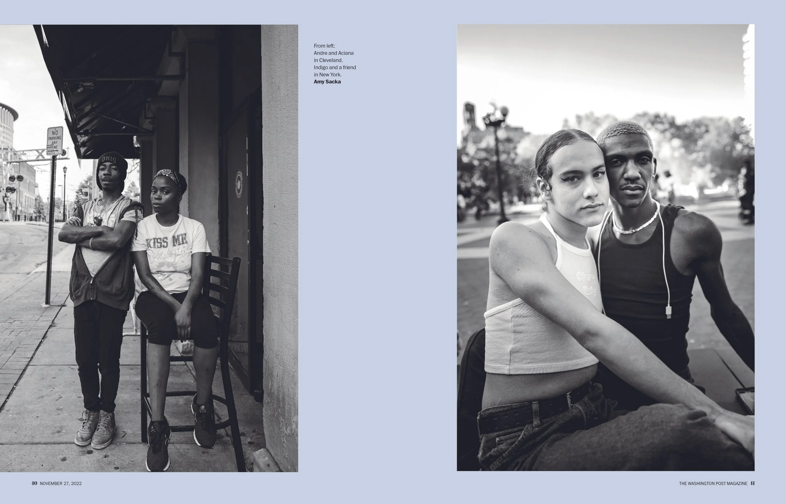
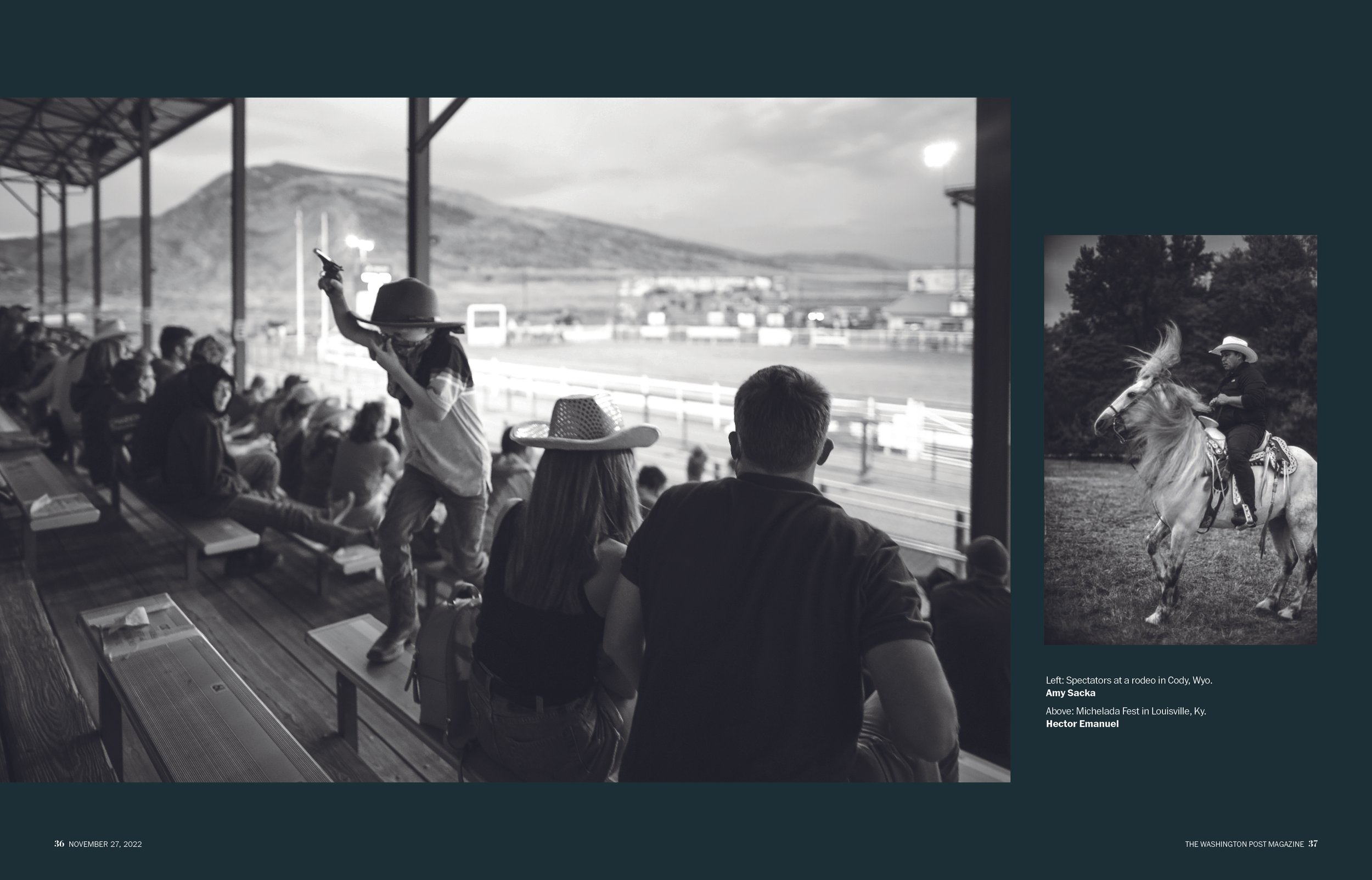
Alternative storytelling formats present many challenges, akin to creating a new product. These pages about people on the street and their music were complex. We did internal user testing to make sure the experience was clear. We also experimented with requiring readers to make a choice at the top to see if it would encourage audio usage.
Designers: Cece Pascual and Carson TerBush
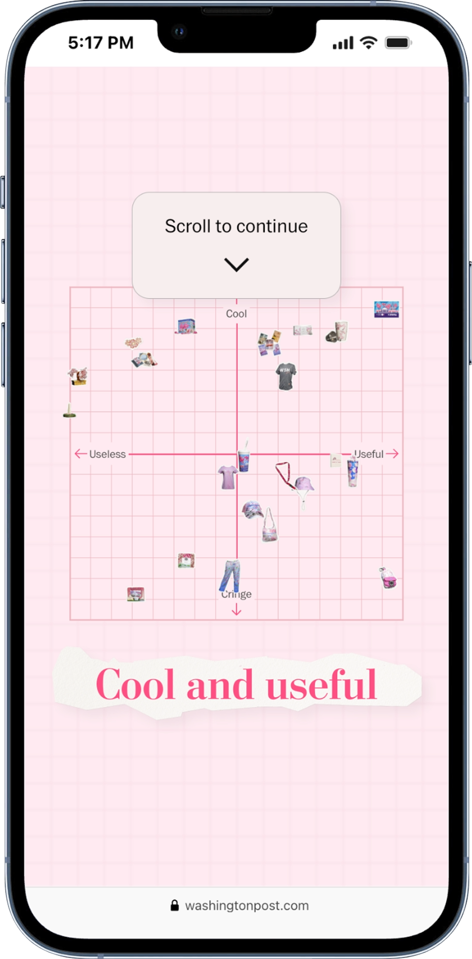
We used a grid matrix to bucket a series of items in four categories. When this story was pitched, we discovered that there was a matrix component in development — just waiting to be used. After finessing, the tool’s delightful nature matched the playful tone of the story.
Designers: Katty Huertas and Joe Fox
Other
We made sure the video dimensions on this page were responsive, serving the reader horizontal versions for desktop and vertical for small screens. The looping videos were the highlight of the page so it was critical to make the experience feel immersive no matter the device.
Designers: Natalie Vineberg and Stephanie Hays
We had to find ways to organize a page with 101 items. We did that by using accordion components to keep the scroll depth manageable. We also intentionally overindexed on navigation and share components to make sure the reader never felt trapped.
Designer: Tyler Remmel
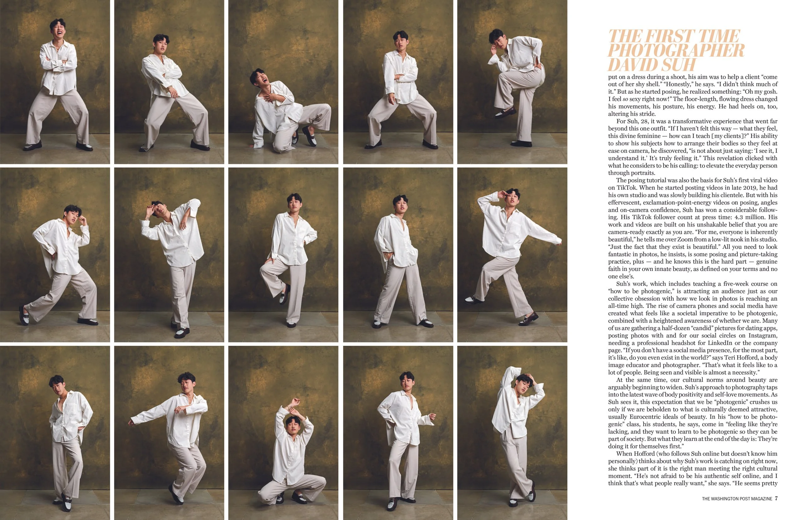
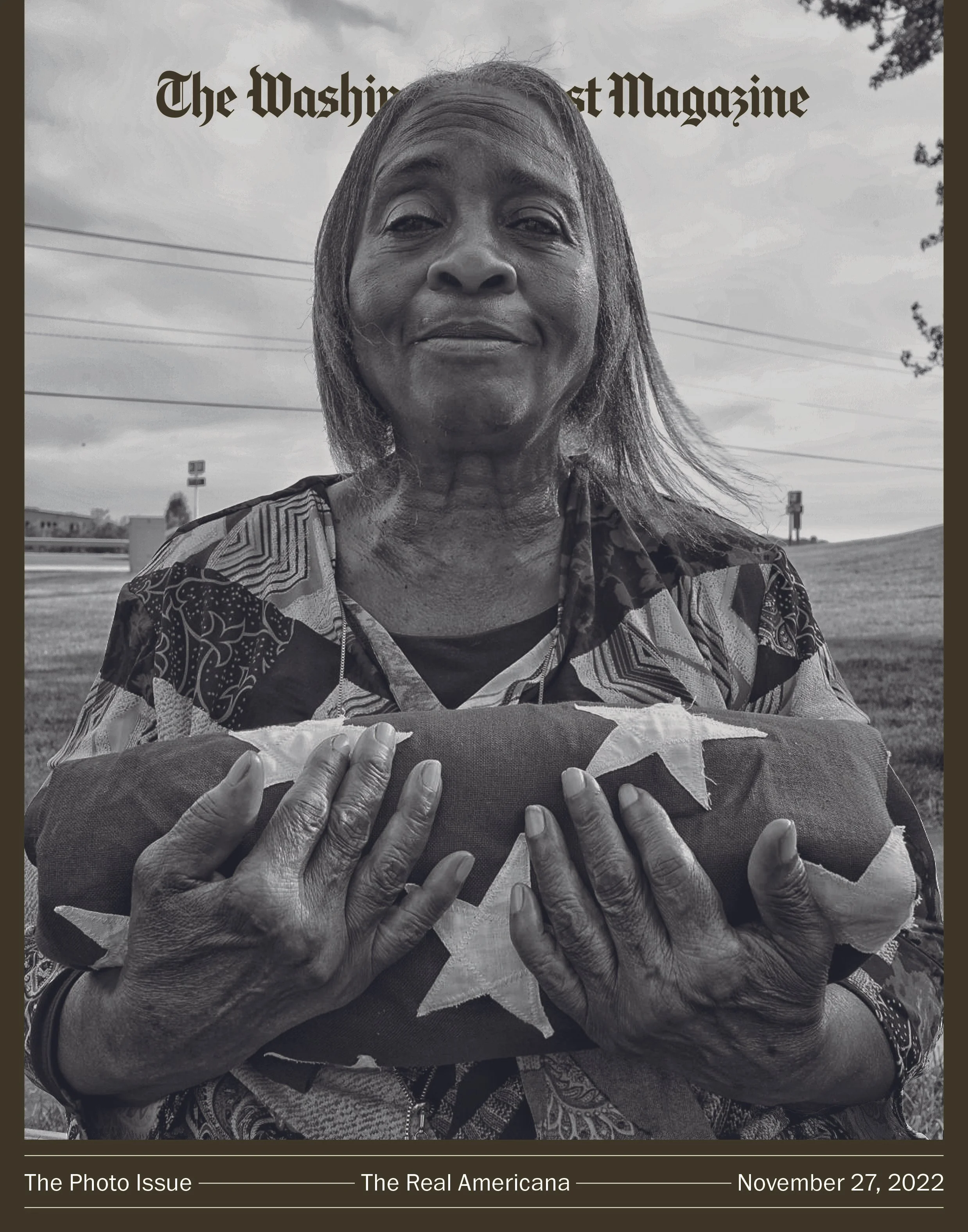
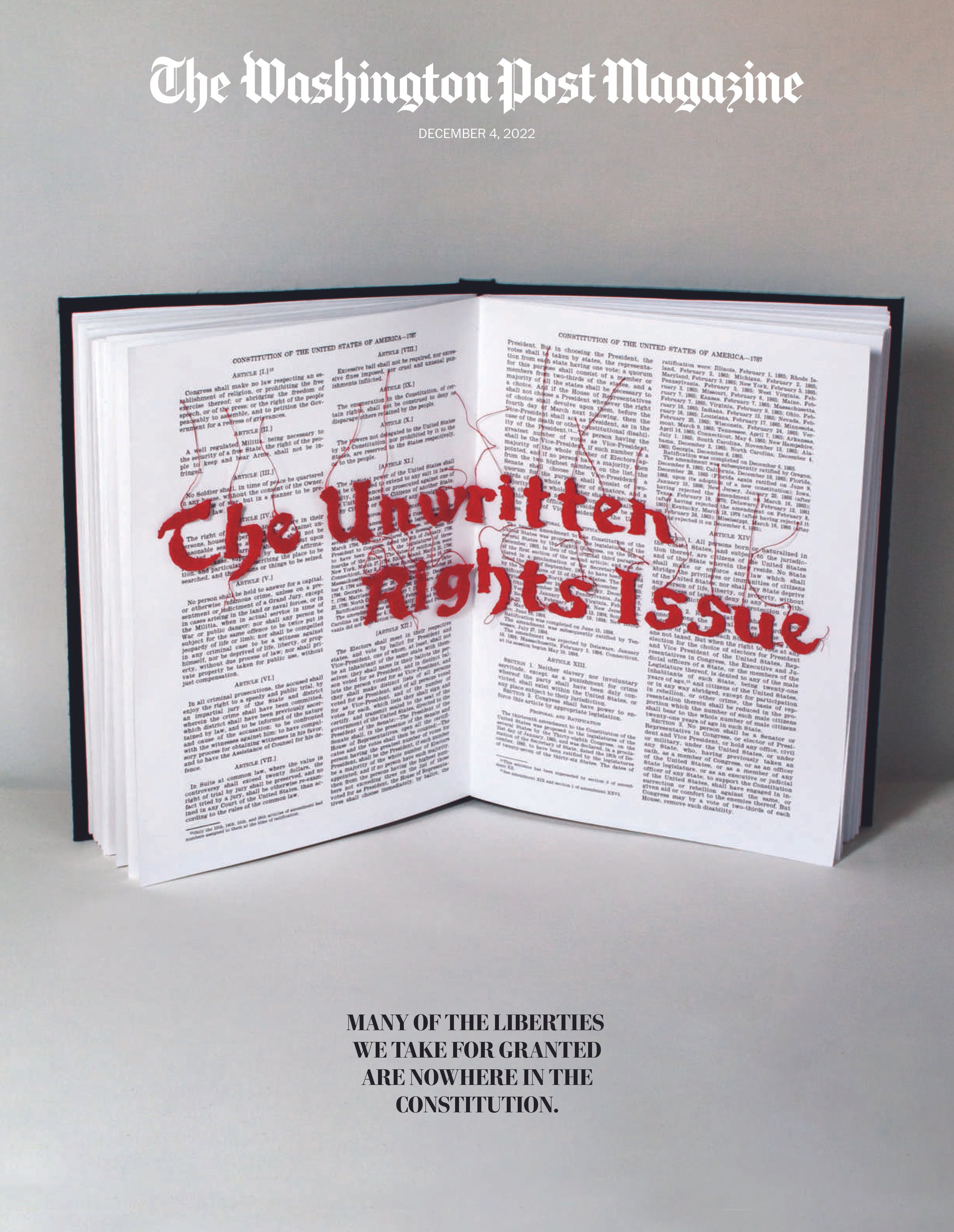
Print design
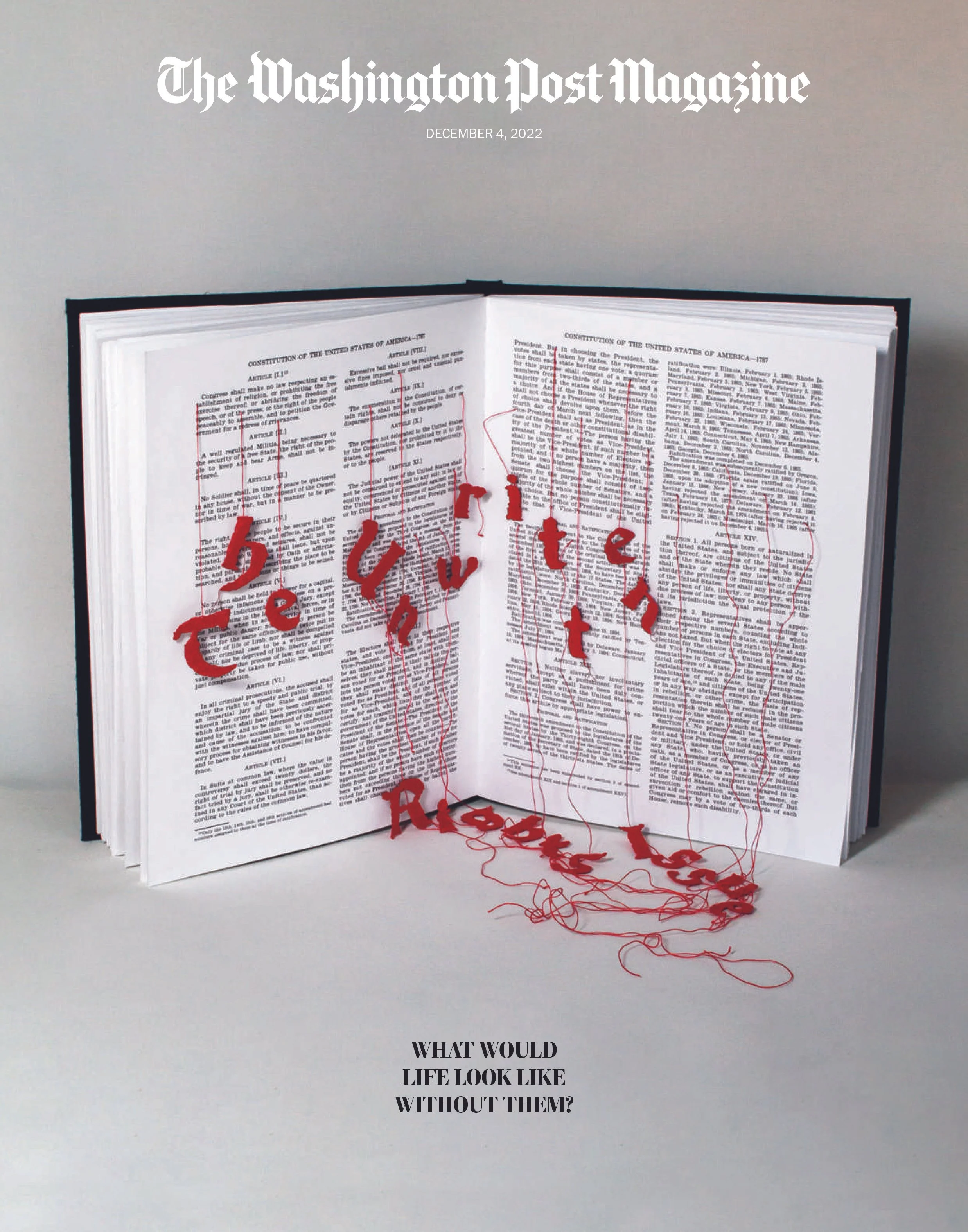
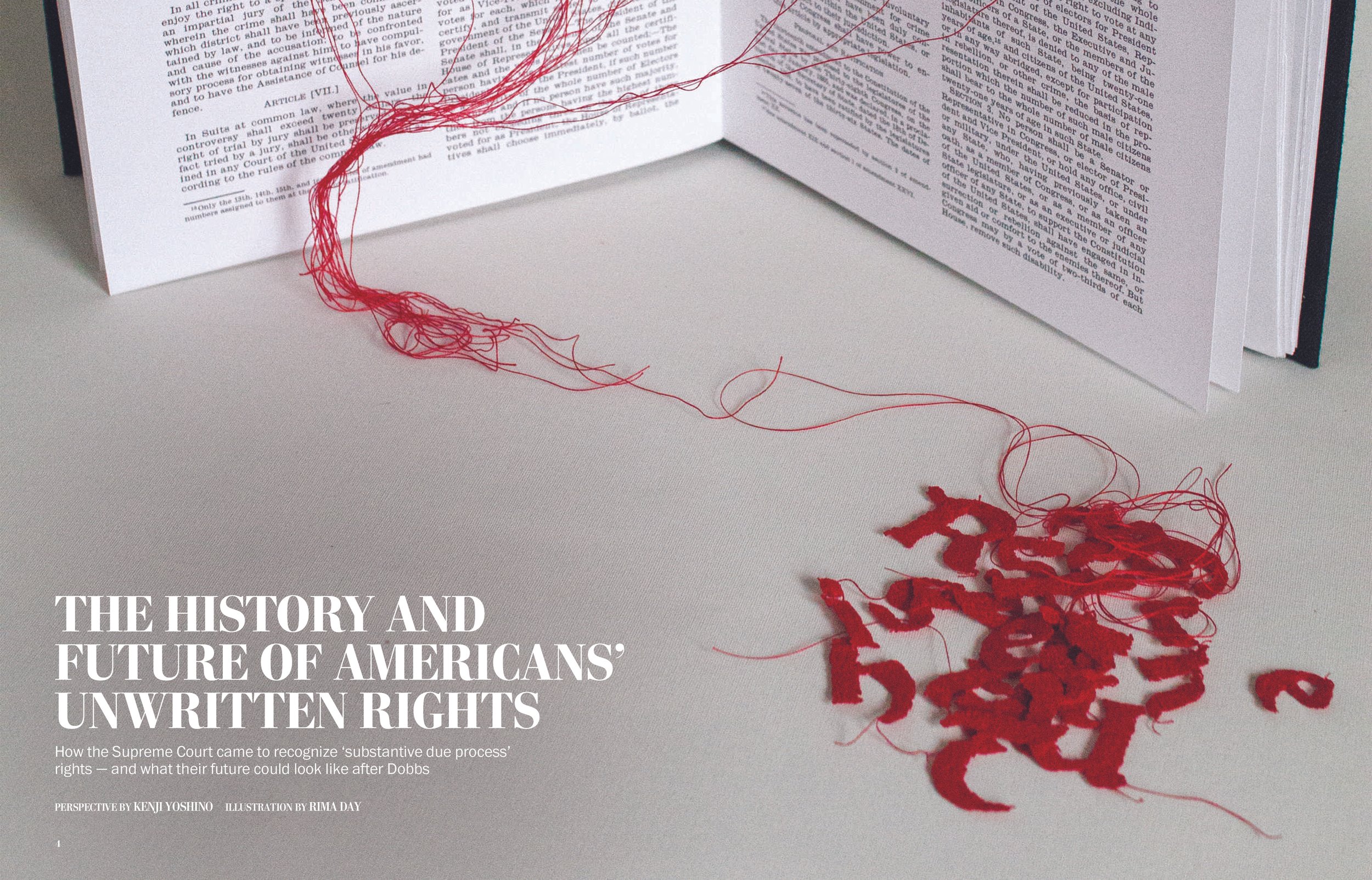
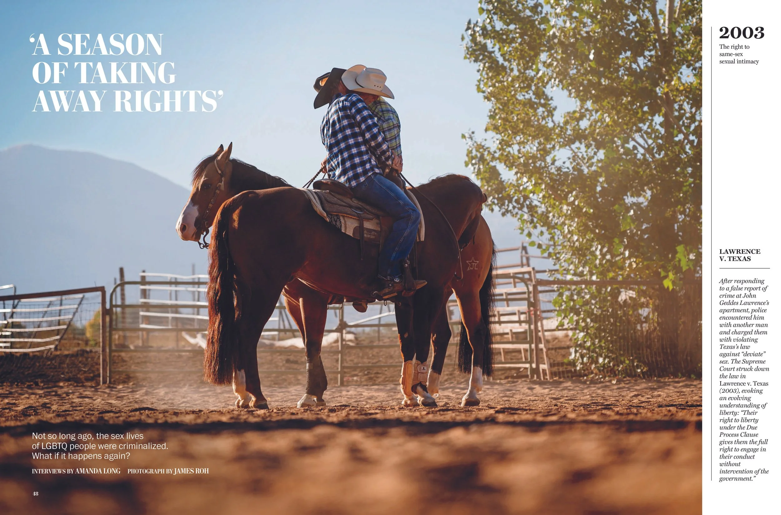
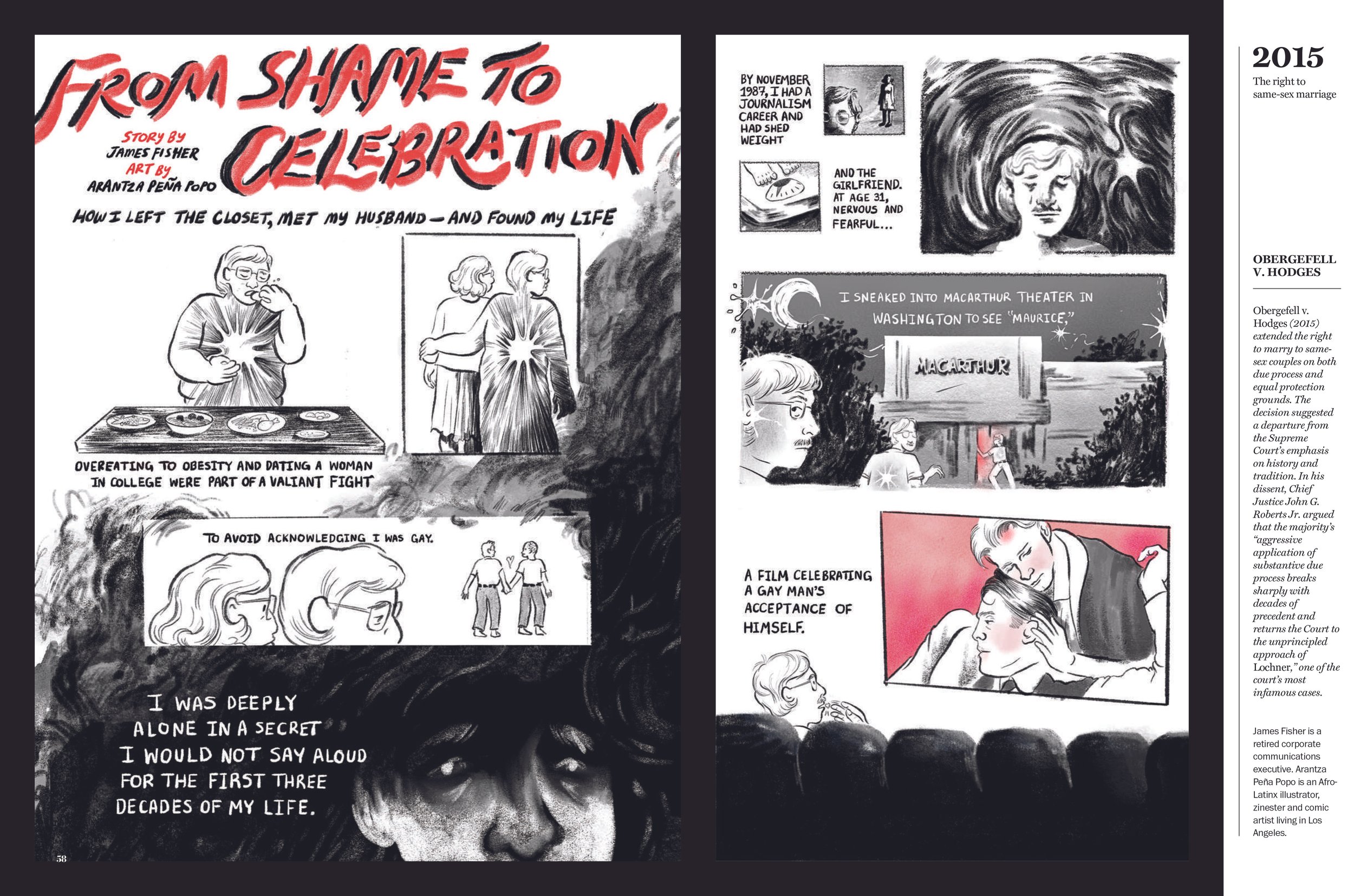
As a Design Editor overseeing The Washington Post Magazine in 2022, we produced three consecutive issues that comprised an entry that won an Award of Excellence for magazine design at the Society for News Design competition.
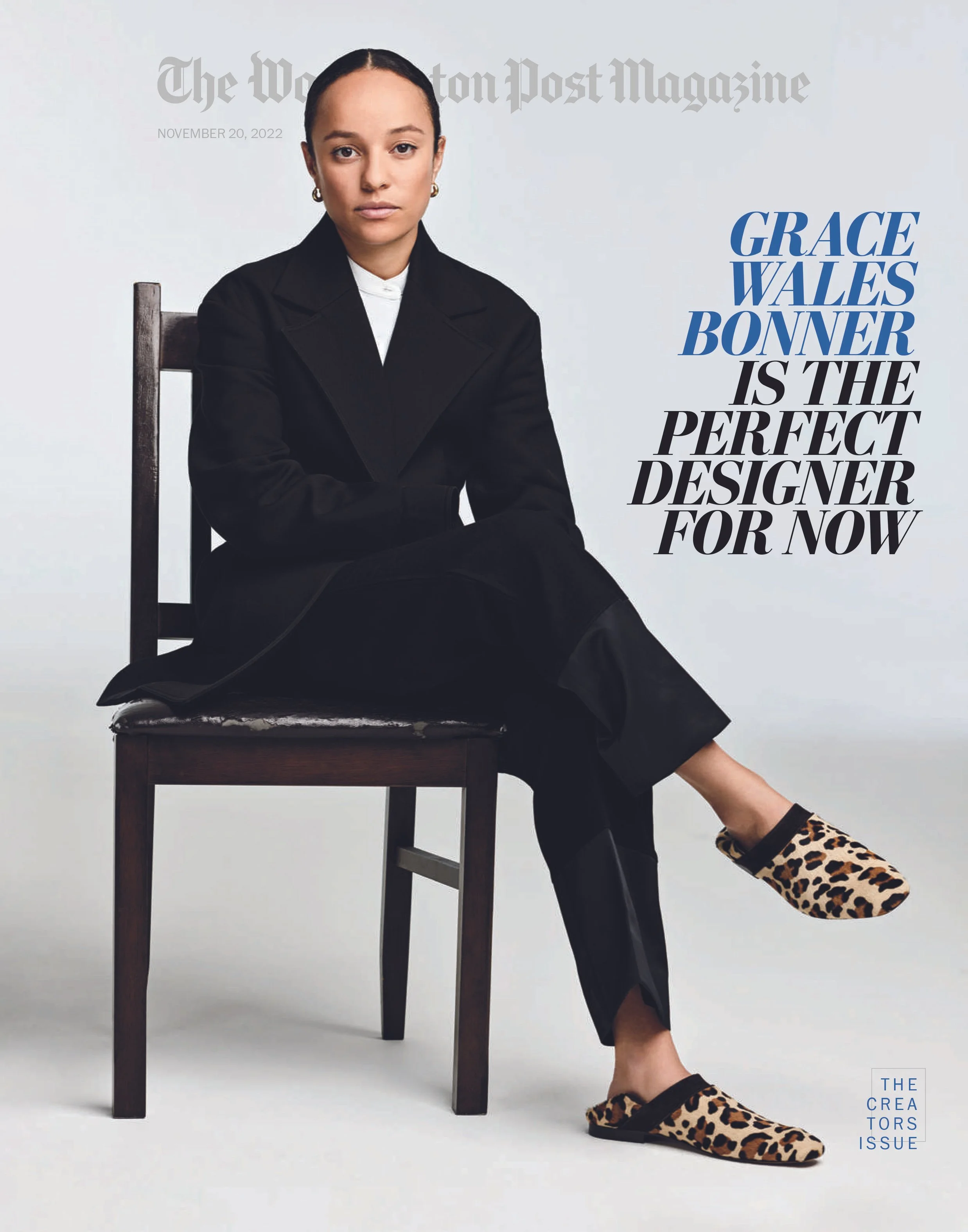
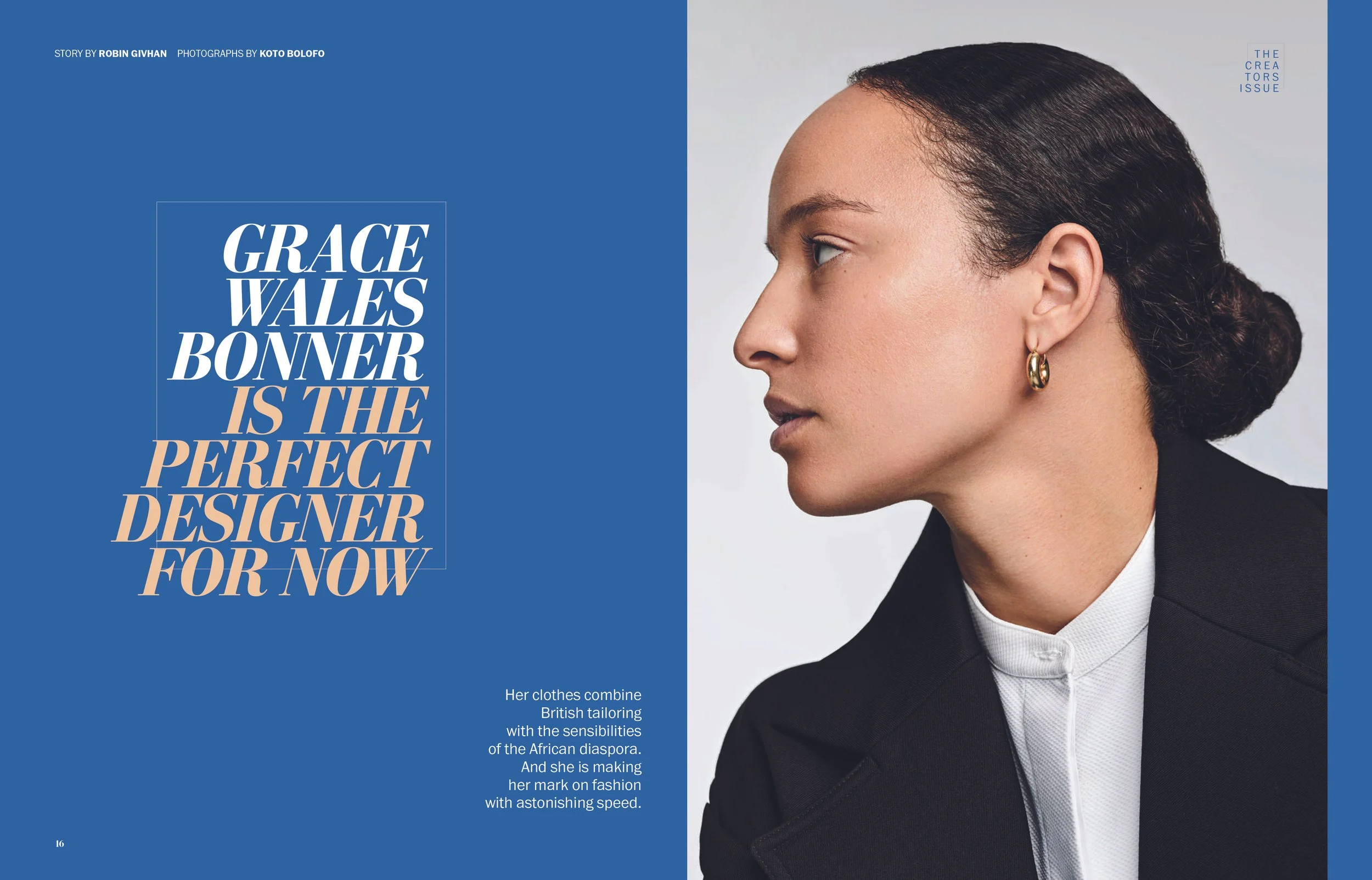
Designer: Brandon Ferrill
Designer: Natalie Vineberg
Designer: Marissa Vonesh